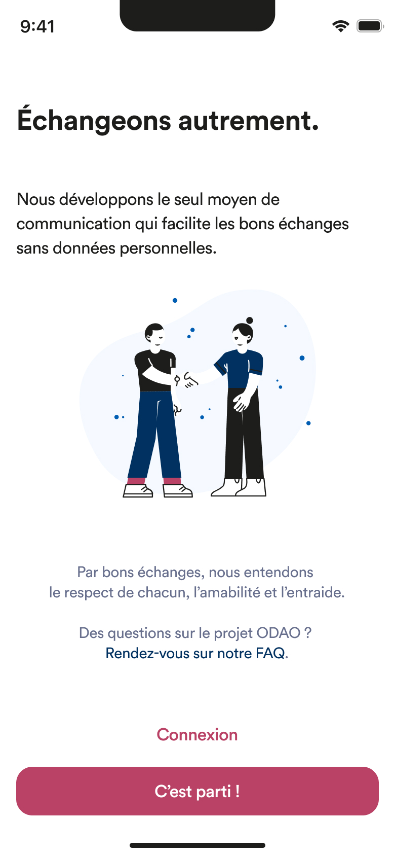
The purpose of ODAO, is to put people back at the heart of stories, by encouraging connections through objects and without collecting personal data.
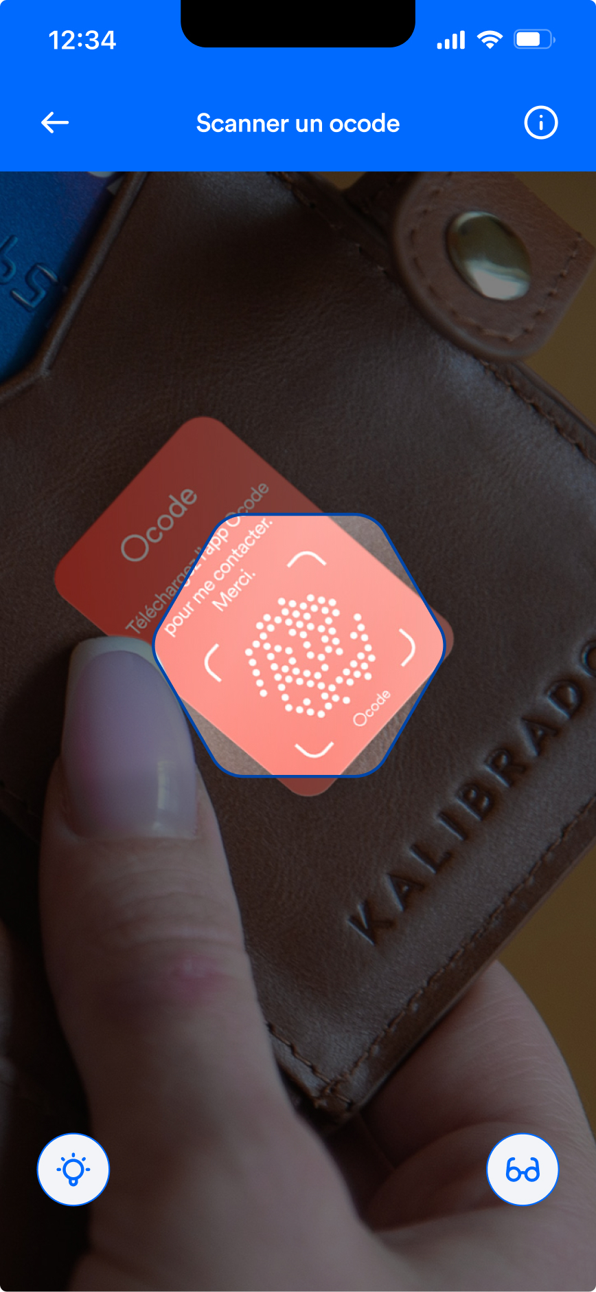
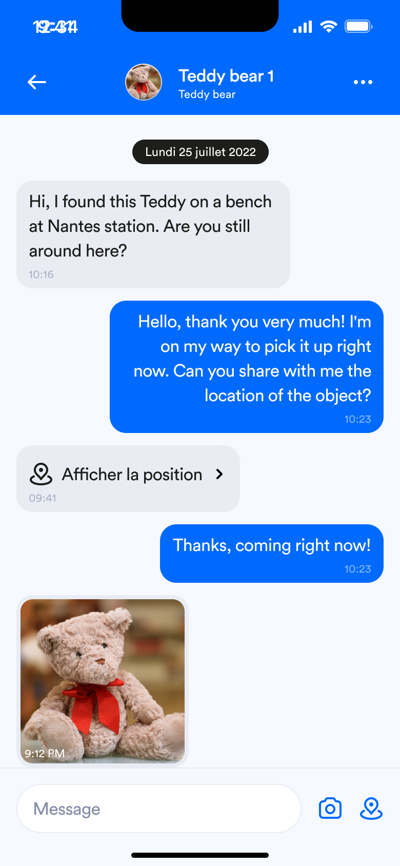
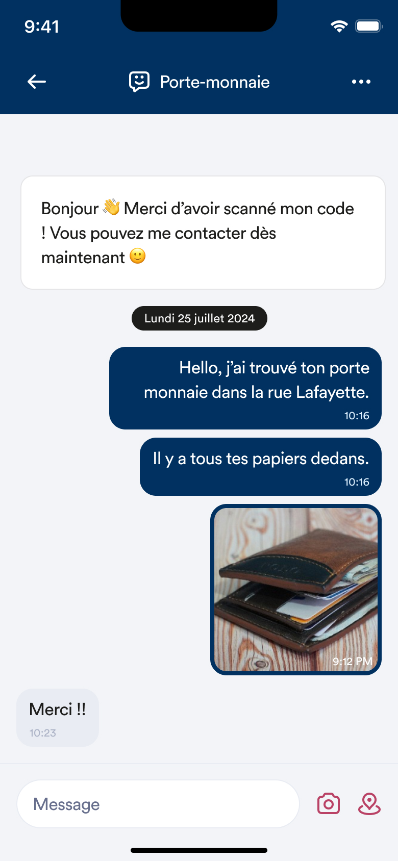
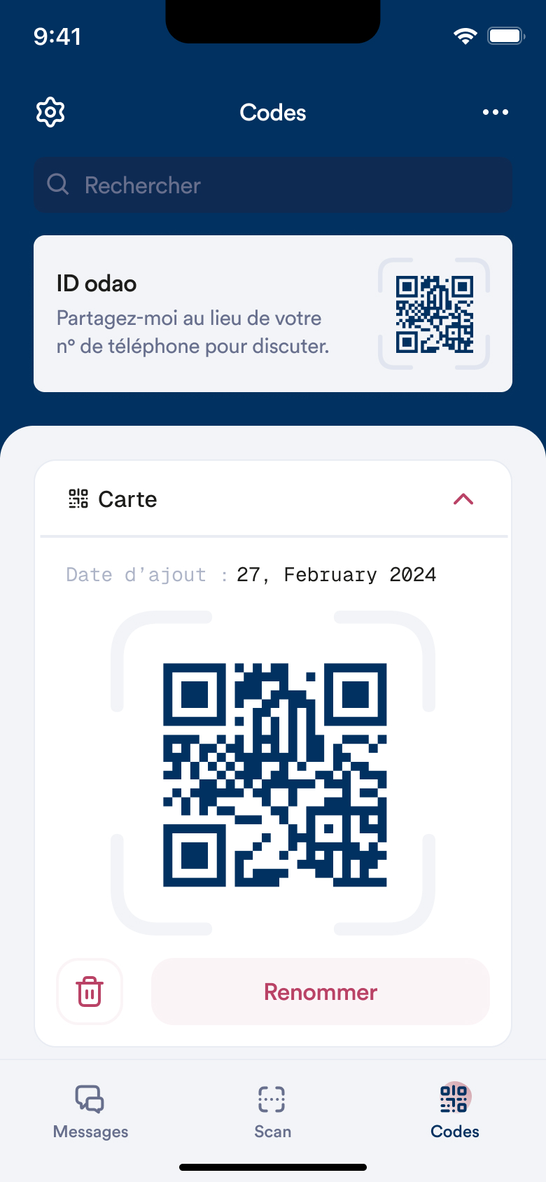
Stick a code QR on one of your belongings and save it in the app. If someone finds it, she can contact you, just by scanning the code. And all without giving out a phone number or email address. Just to be helpful.
Tasks : Continuously improve the user experience on the application and web app.
The application is undergoing a change, with the use of a QR code instead of another type of code, owned by the start-up Ocode. The watchword? Simplify!
The project is appealing and has sparked curiosity, but it has also generated misunderstanding and concern. So we are revisiting the initial requirements, relying on our users, and designing the best possible path for greater clarity and less stress.
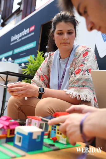
The project has been tested with various target audiences, including universities, festivals, and events such as Web2Day.
While users seem to easily imagine themselves in a “community” context (universities and festivals), it is more difficult to explain around a table. So, to overcome this obstacle, I created a test using Legos. Reproducing a playful environment allowed testers to let go and play without realizing that their actions were being analyzed and their thoughts heard.
“The mandatory photo bothers me. You should offer some generic images if users don't want to take photos.”
“To put codes on all my valuables, the registration process needs to be quick. I don't want to have to add a name, a photo, and choose an initial message 10 times in a row. Couldn't the code be the same for everything?”
“I like the solution, but it will only be really interesting when downloading an app to communicate isn't the only solution.”
Registering a code takes too long; it should be possible to do so in a matter of seconds.
Asking the owner of the QR code to download the app is understandable, but you can't force the person who wants to contact them to do so, as this is a barrier.
The app must be lightweight so that users will keep it, even if they don't necessarily use it every day.
Ensure graphic consistency across different features. Implement a design system to save time on mockups and development.
Free rein to redesign the entire application and propose a more attractive and intuitive version, while also anticipating future features.
When using the application, users must be able to save QR codes in an instant, scan QR codes, and access all of their conversations.
The most complicated part was defining the app's target audience. Since its main purpose is to facilitate the anonymous return of lost items, thereby relieving the owner's stress, it is aimed at a wide audience. Losing something is not specific to any gender, generation, or socio-professional category.
Therefore, as it is aimed at everyone, the app must be simple and quick to use for both students and retirees.
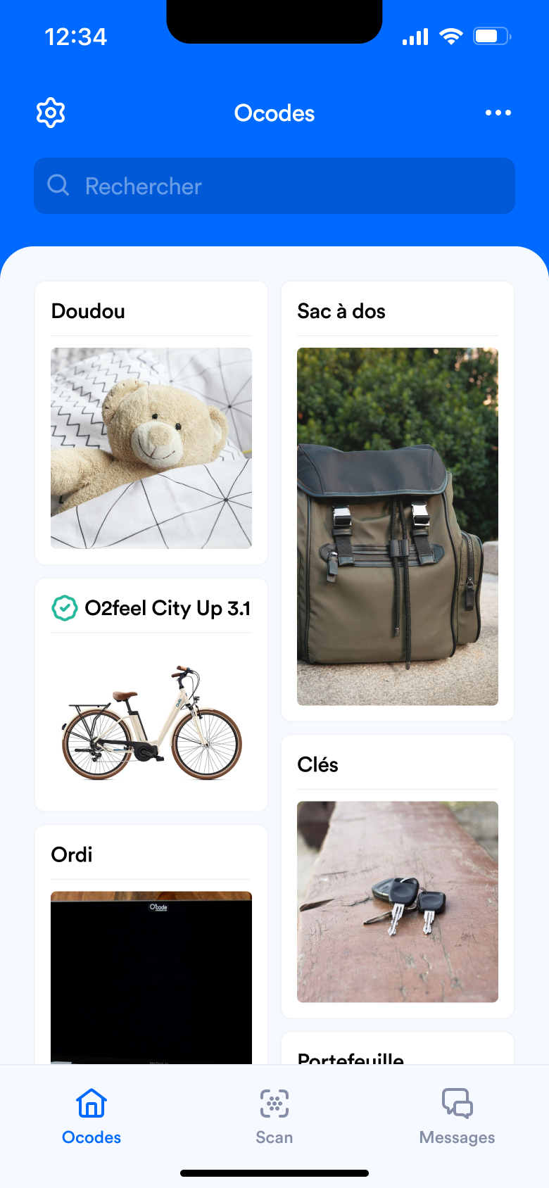
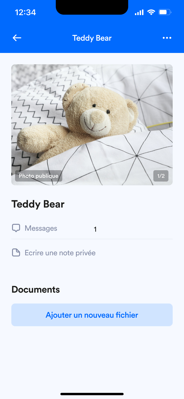
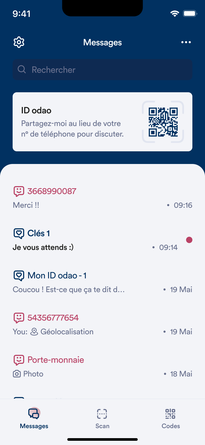
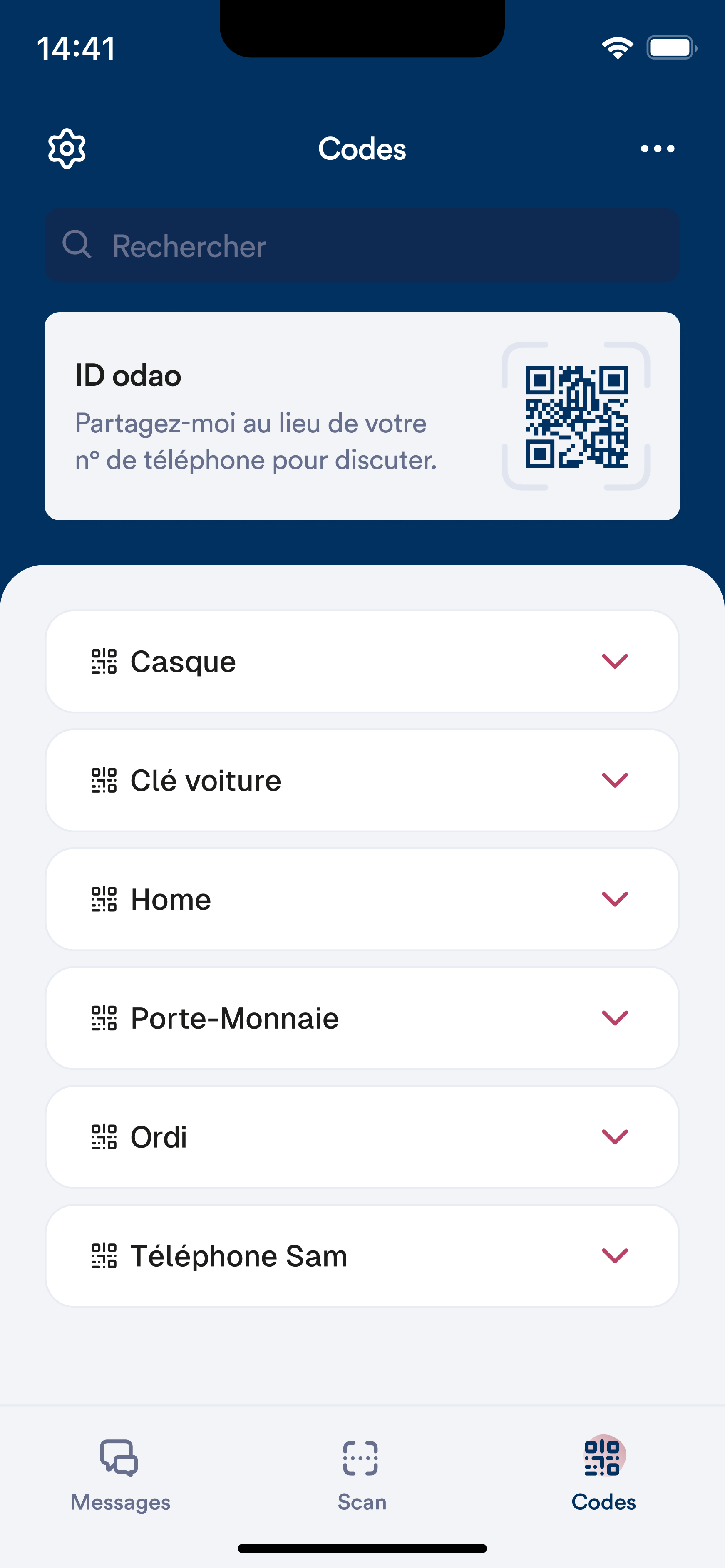
We decided that the app's main screen should be the messaging service. Once a QR code is saved in the app, the messaging service becomes the heart of the project. Furthermore, having this screen first indicates to users that the app is primarily a messaging service and that QR codes are like phone numbers (or contacts).
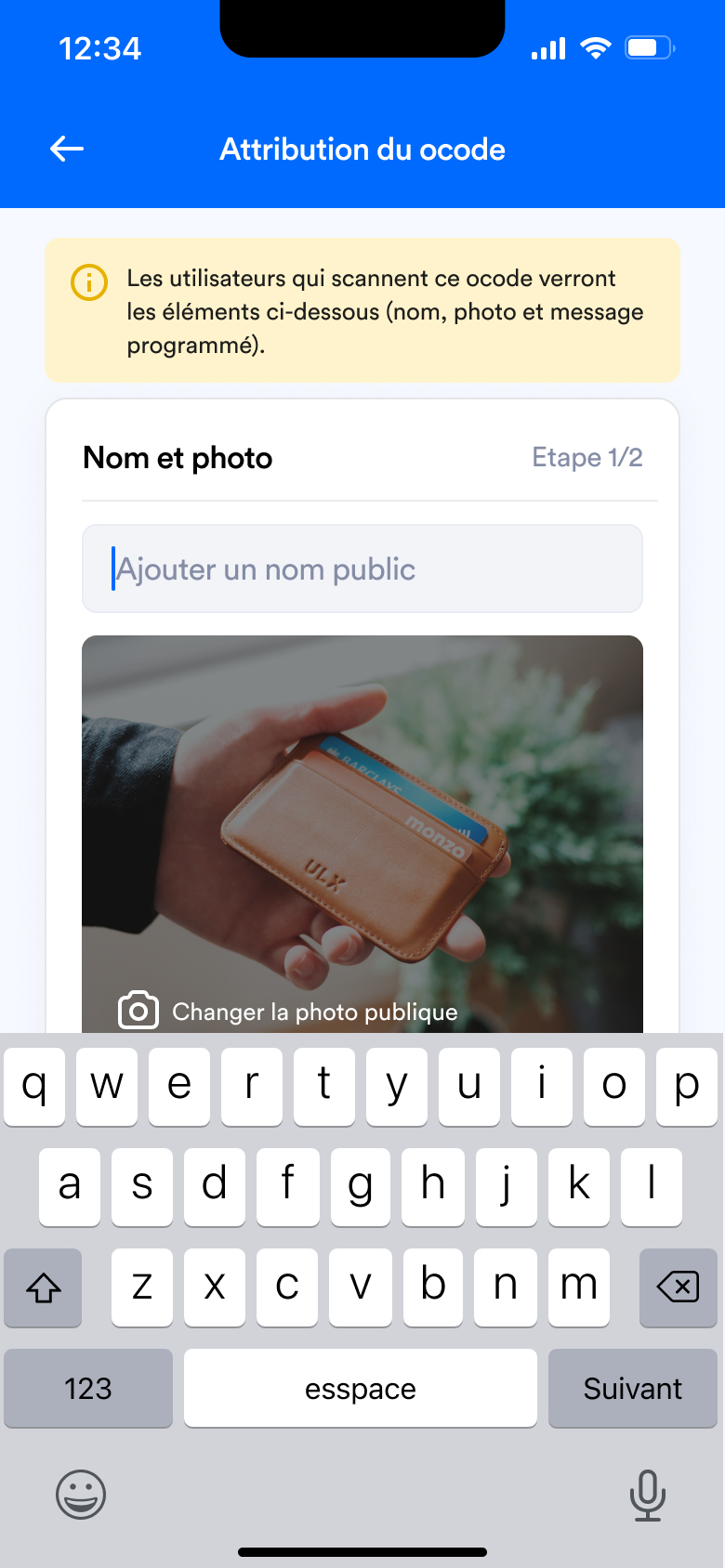
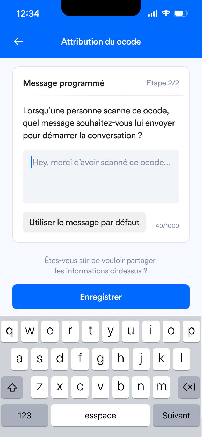
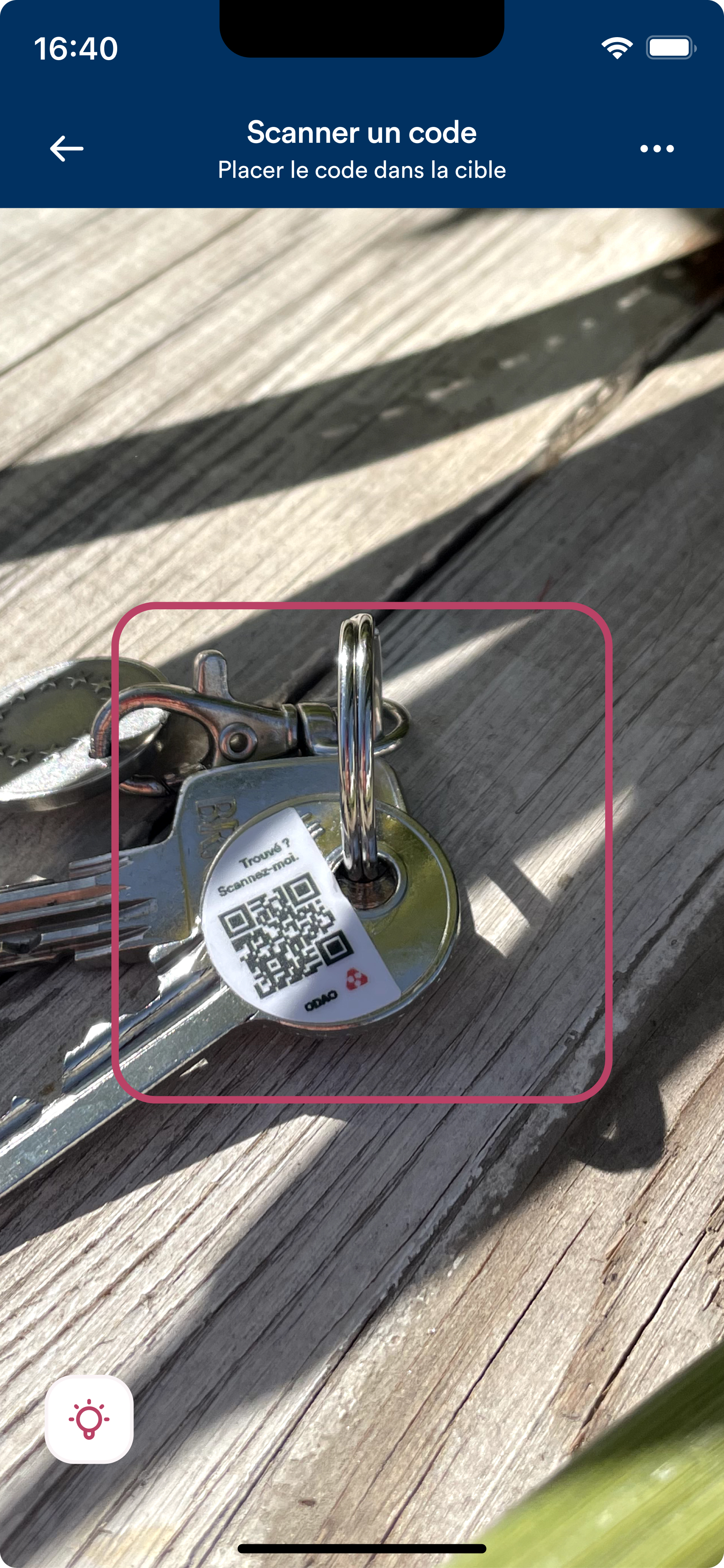
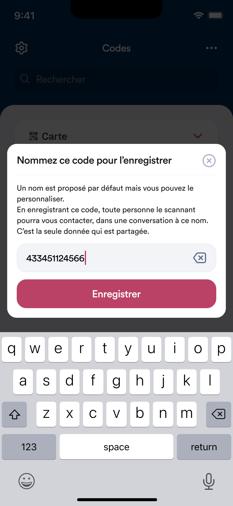
To save a QR code, simply scan it. What used to take a minute now takes three seconds. I scan, confirm, and it's saved. It is of course possible to give it a nickname, but if the user doesn't have the time or inclination, it's not a problem. By default, the QR code will have a code as its name. This can of course be changed indefinitely at a later date.
On the graphic side, we redesigned the Design System with a new color scheme based on two shades: blue and pink. Although blue was already used before, we opted for a less electric color, and therefore a darker shade. But to counterbalance this, we paired it with a shade of pink, which allows certain elements, such as Call-To-Action buttons, to stand out.
As versions evolve, we are moving towards simplified versions that are more responsive to users' needs. What is interesting is that in a previous version, the majority of testers indicated that they wanted a photo of the object associated with the QR code. And, after responding to this need, the testing phase with this feature revealed that users ultimately do not want to take photos, due to concerns about personal information or the time involved in taking photos.
Working on a meaningful project that addresses social issues and solidarity is something that motivates me, even if it means creating dozens and dozens of different versions to move forward. What's more, it has an ecological/economic impact (an item returned to its owner is one less item abandoned in the environment and one less item manufactured/sold to replace it). At a time when our society is experiencing overconsumption, such a project aligns with my values and inspires me.
To learn more about my involvement in this project, I would be happy to discuss it over coffee or tea! 🫖