The genesis of this initiative stems from a government decision to mark each bicycle sold from January 1, 2021, with a “registration” code and to keep a register with a description of each bicycle and the contact details of its owner.
To make this possible, the government is asking professionals (manufacturers and bicycle dealers) to enter the exact details of the bicycle in this register. Cyclists, for their part, must ensure that this information is always up to date and, if not, report any changes (theft, sale, destruction).
So we are talking about two different platforms here, one for bicycle shops and one for cyclists.
Task : Improving platforms for bikeshops and cyclists.
In response to the urgent legal issue, a platform was created to enable bicycle dealers to register new bicycle owners and their new purchases in the national registry.
Bicycle shops do not register (all) bicycles, or make mistakes that they cannot resolve themselves afterwards because the platform is not intuitive and has many bugs.
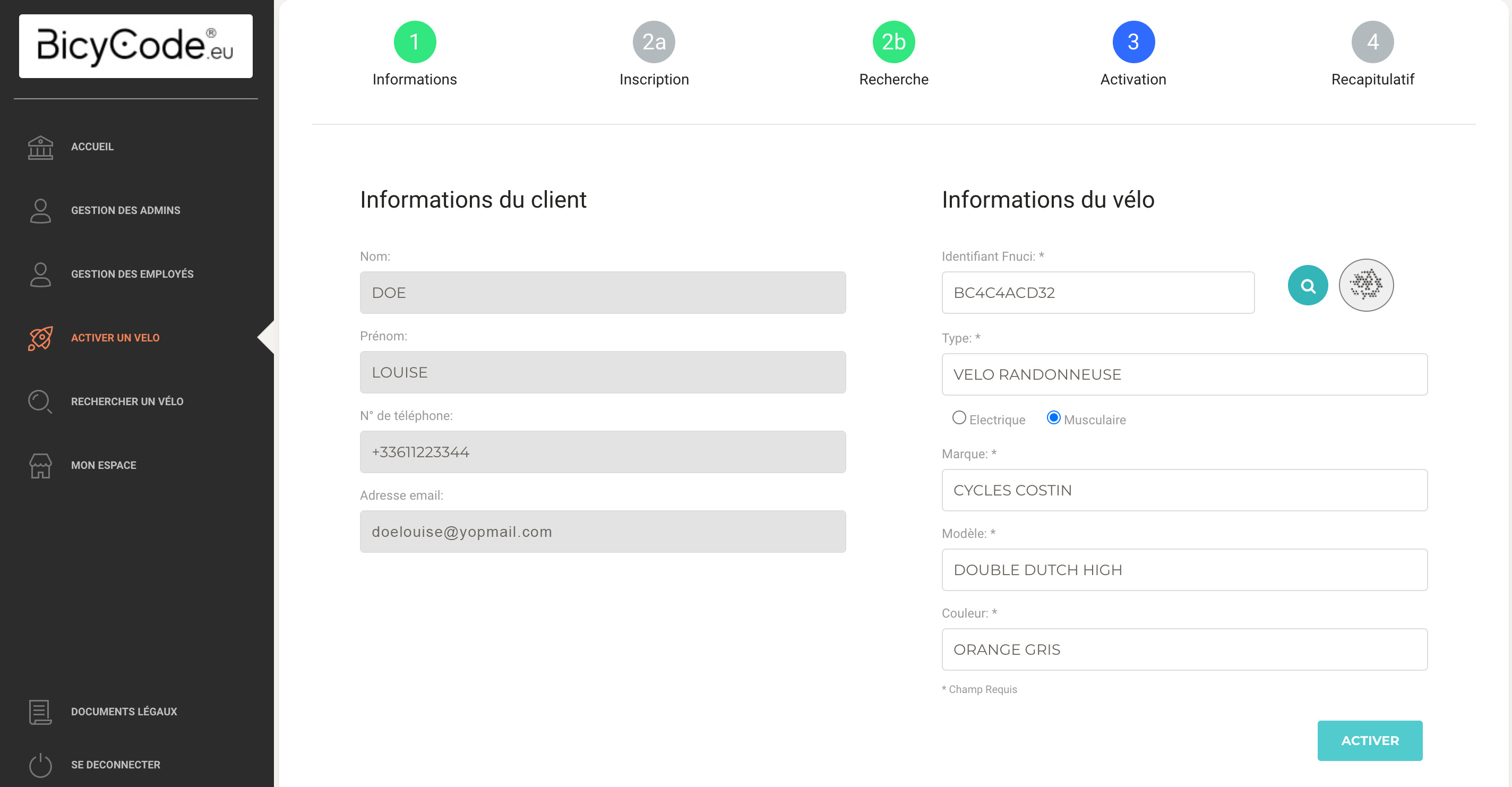
Take stock of bugs, user feedback, and user behavior in order to propose a brand new platform. Where possible, this platform should be available to bicycle retailers within 6 to 8 weeks.
“It’s unclear. Several times, I thought I had registered a bike, when in fact I hadn’t completed the process. And in the end, I lost everything.”
“The home page is useless; it just repeats the menu on the side.”
“Every time I have to go to the platform, I press the wrong button and waste a lot of time.”
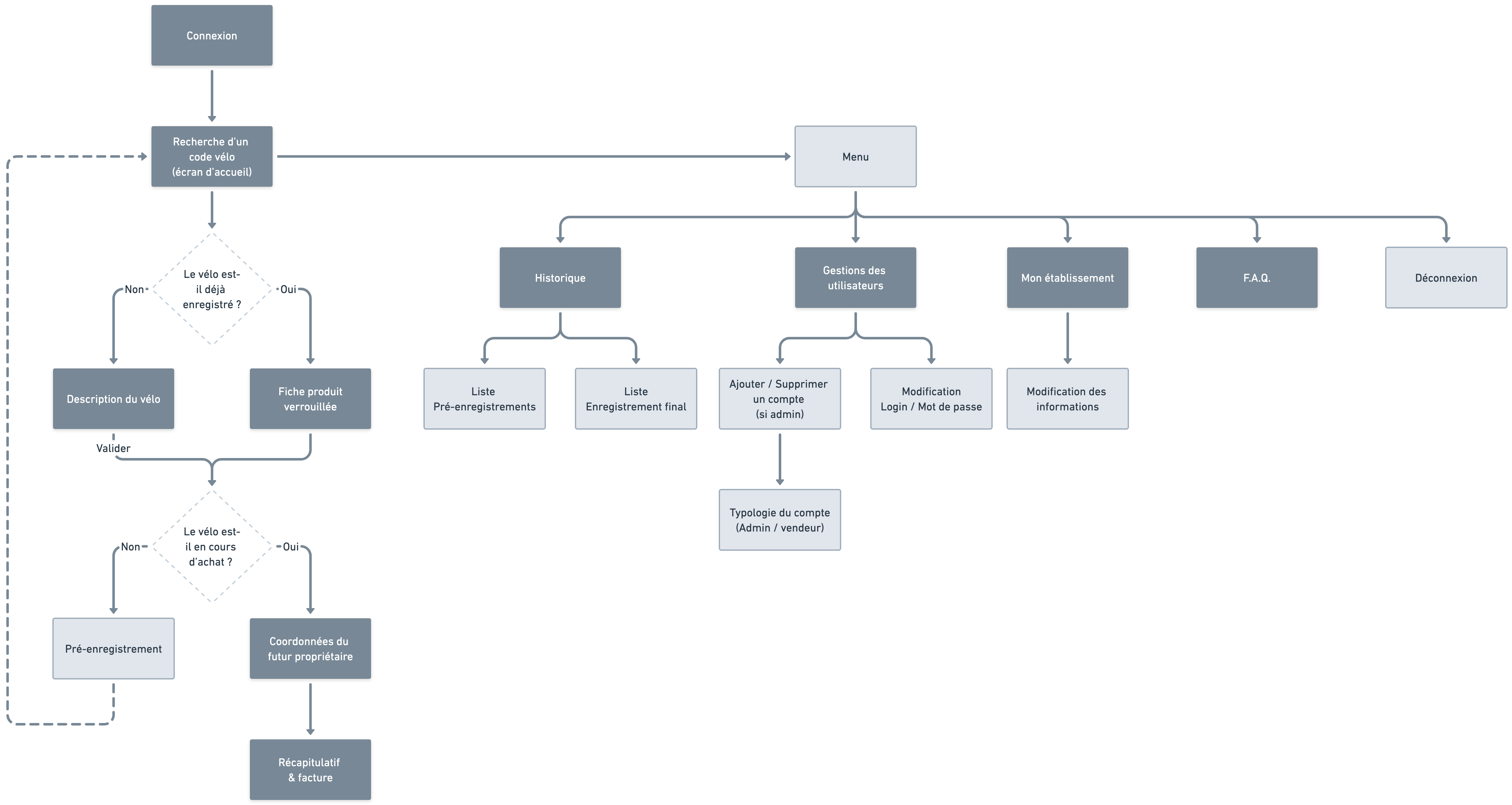
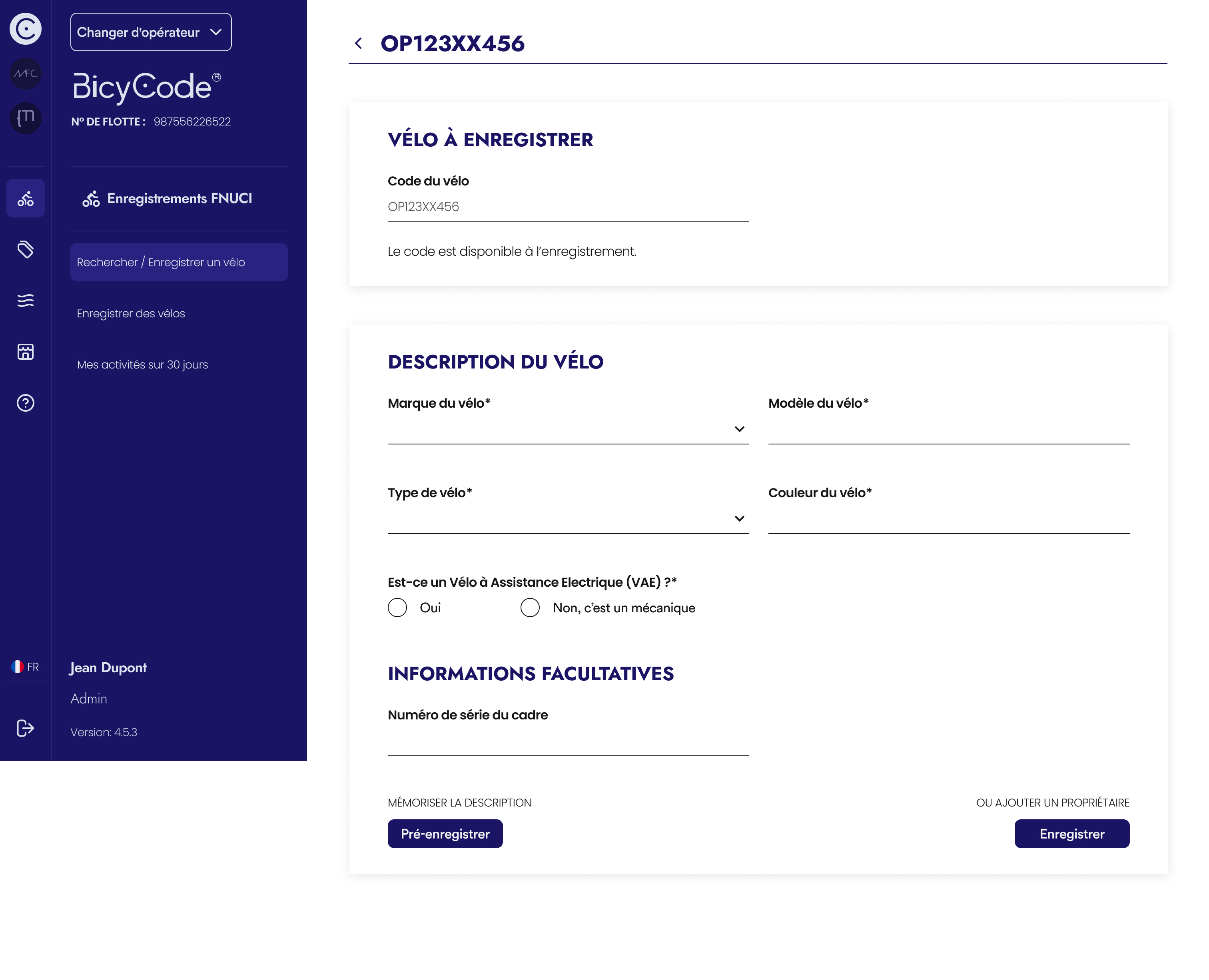
Now you can search for a bike right from the home page. This is the platform's main feature, as it allows you to either register a new bike or find a bike that has already been registered. It therefore needs to be prominent and accessible without wasting any time.The menu has been redesigned to be clear and intuitive, allowing the platform's content to be organized in the best possible way.
Color harmonization has also been revised to send clear messages to users and prevent them from getting lost in a flood of irrelevant information.
Finally, the bike registration process has been redesigned to be more efficient. The bike shop owner will first describe the bike and then register its owner. This allows them to pre-register the bike description in their spare time and speed up the sales process.
Of course, the platform will evolve over the years. New features are added, and improvements to the user experience and wording are made on an ongoing basis.
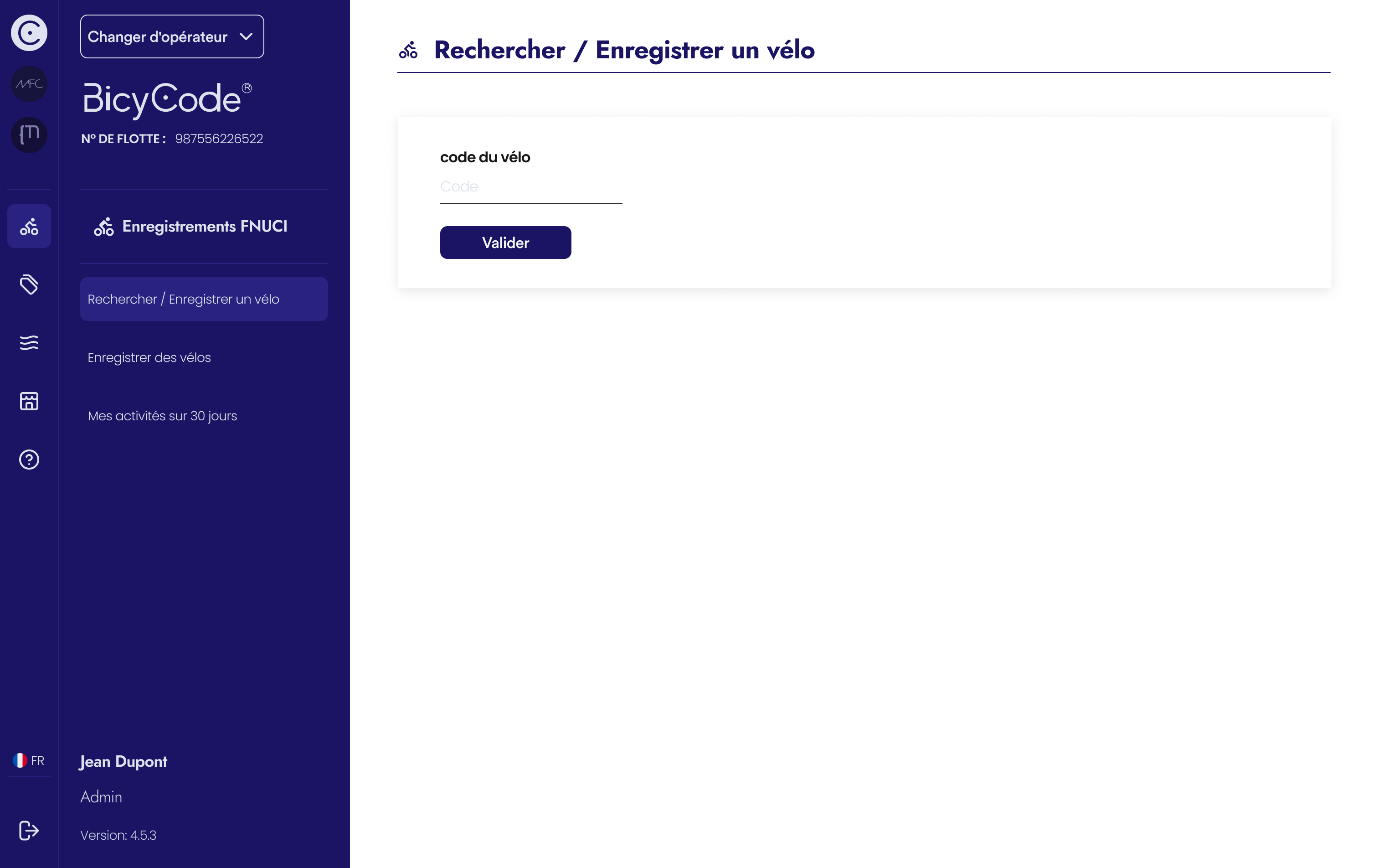
Few bike owners are aware of the upcoming reform, making it difficult to anticipate usage patterns a few weeks before its implementation. The assumptions prior to the reform were therefore as follows:
Six months after the launch of the first platform, user feedback shows that these assumptions are incorrect. A platform is therefore needed that truly meets their needs, beyond the regulatory administrative process.
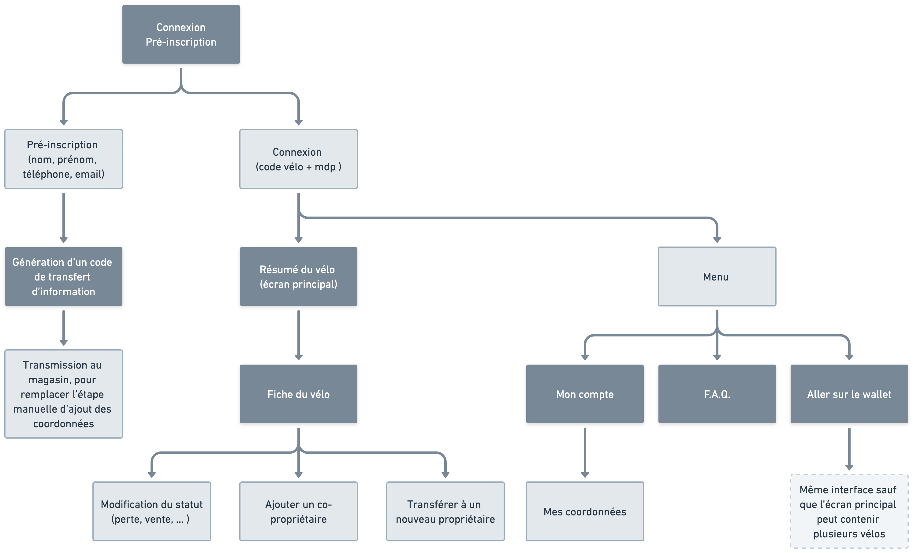
The first version is synonymous with frustration and annoyance, which must be put to an end, in particular by reviewing the concept of user accounts and the mobile-first/desktop experience.
The charter needs to be improved to make users want to use the interface and feel that it is easy to use.
By learning from user feedback, define the new experience so as not to lose them and not add stress during the process. The platform must also have added value for the user. The regulation part must go unnoticed amid the features, so that it is respected and accepted.
In stores, users are focused on purchasing their bike, not the regulatory framework surrounding it. This step is done at home, on a computer. The mobile-first approach is therefore not essential, whereas it is necessary on desktop.
“I just bought two bikes for my children, and you're telling me that I have to remember the two registration codes so that one day, if they get stolen, I can remember them and log in twice to report them. And that it will only help if the police find them? I have better things to do.”
“I'll look when I get home.”
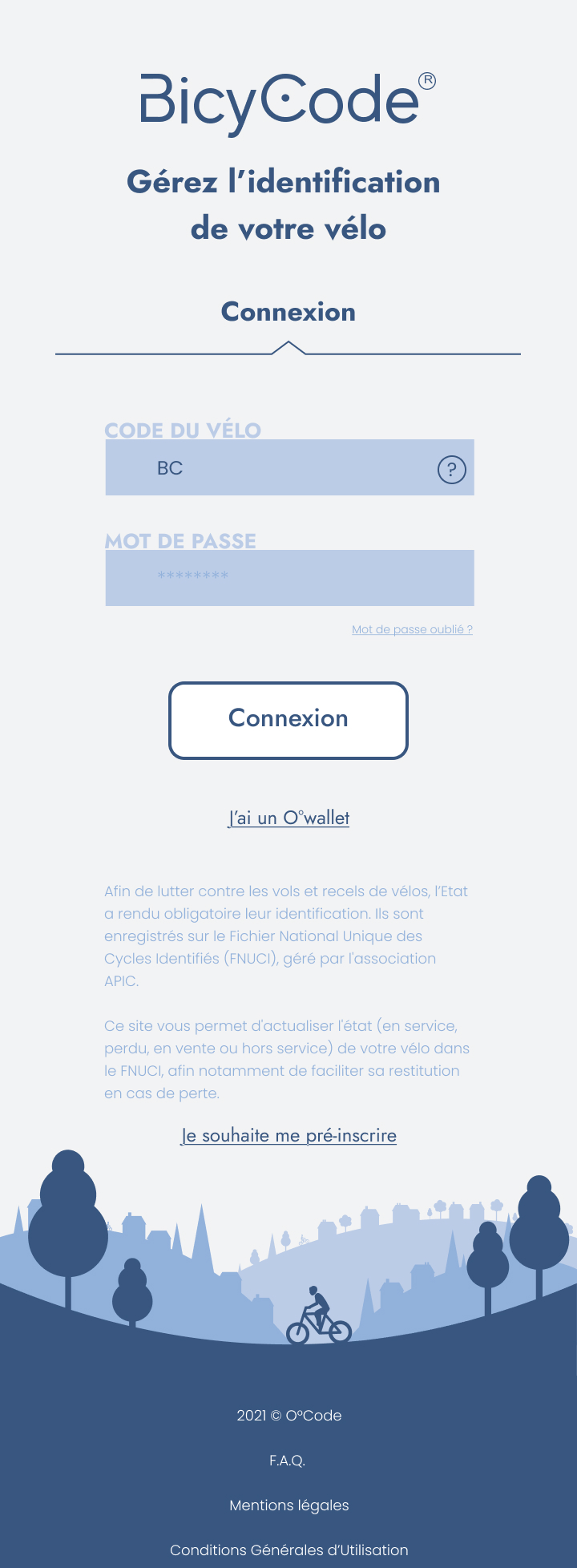
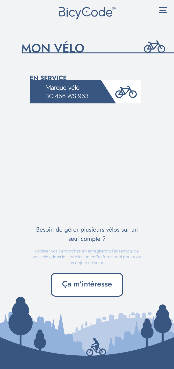
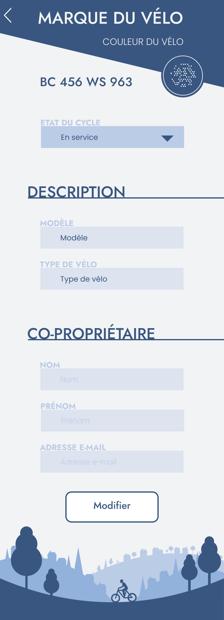
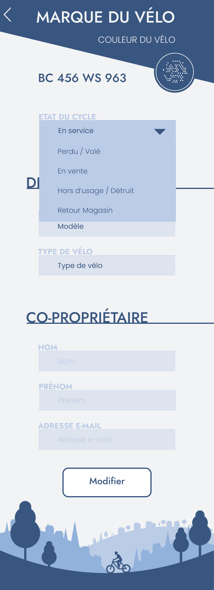
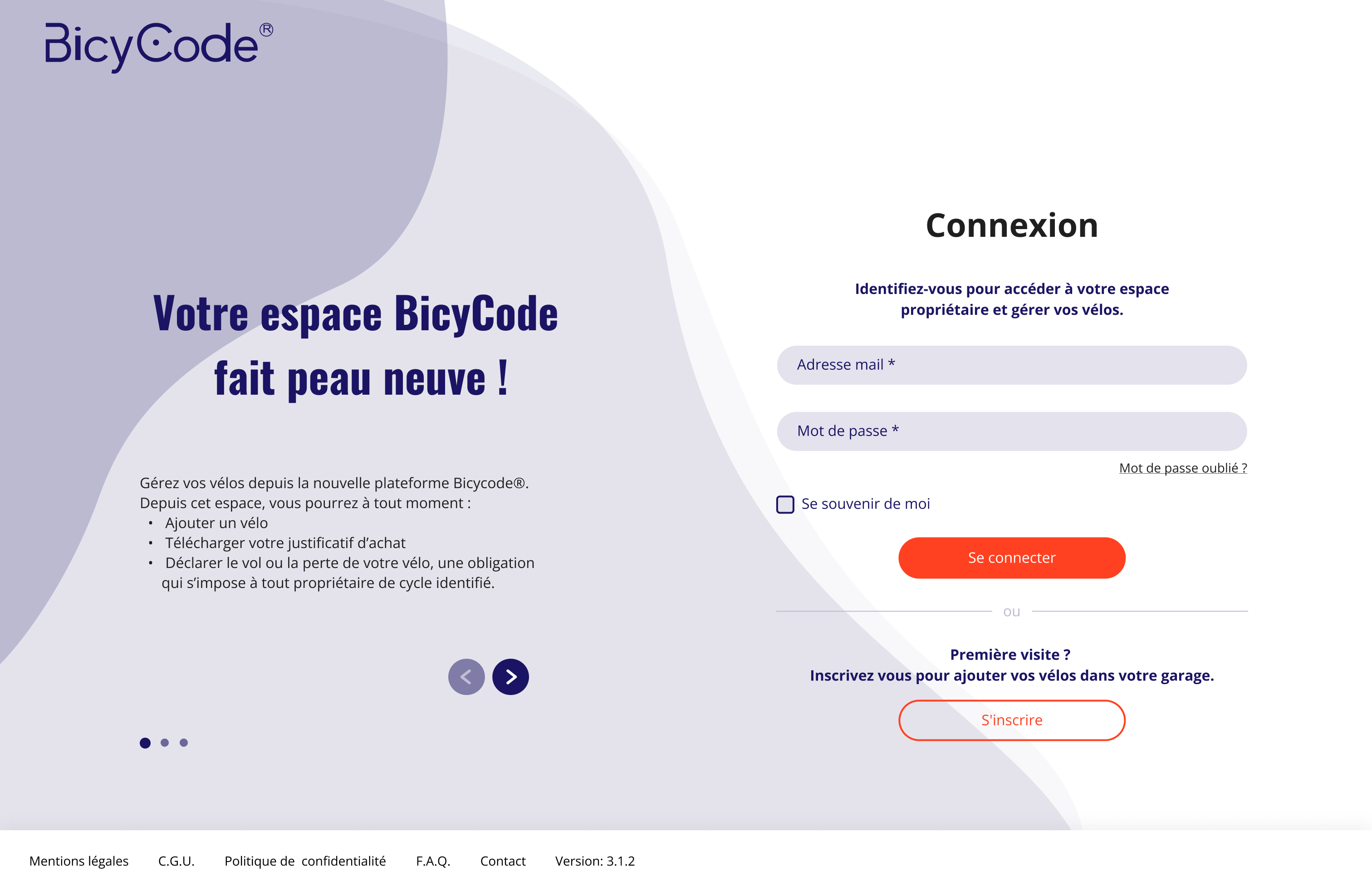
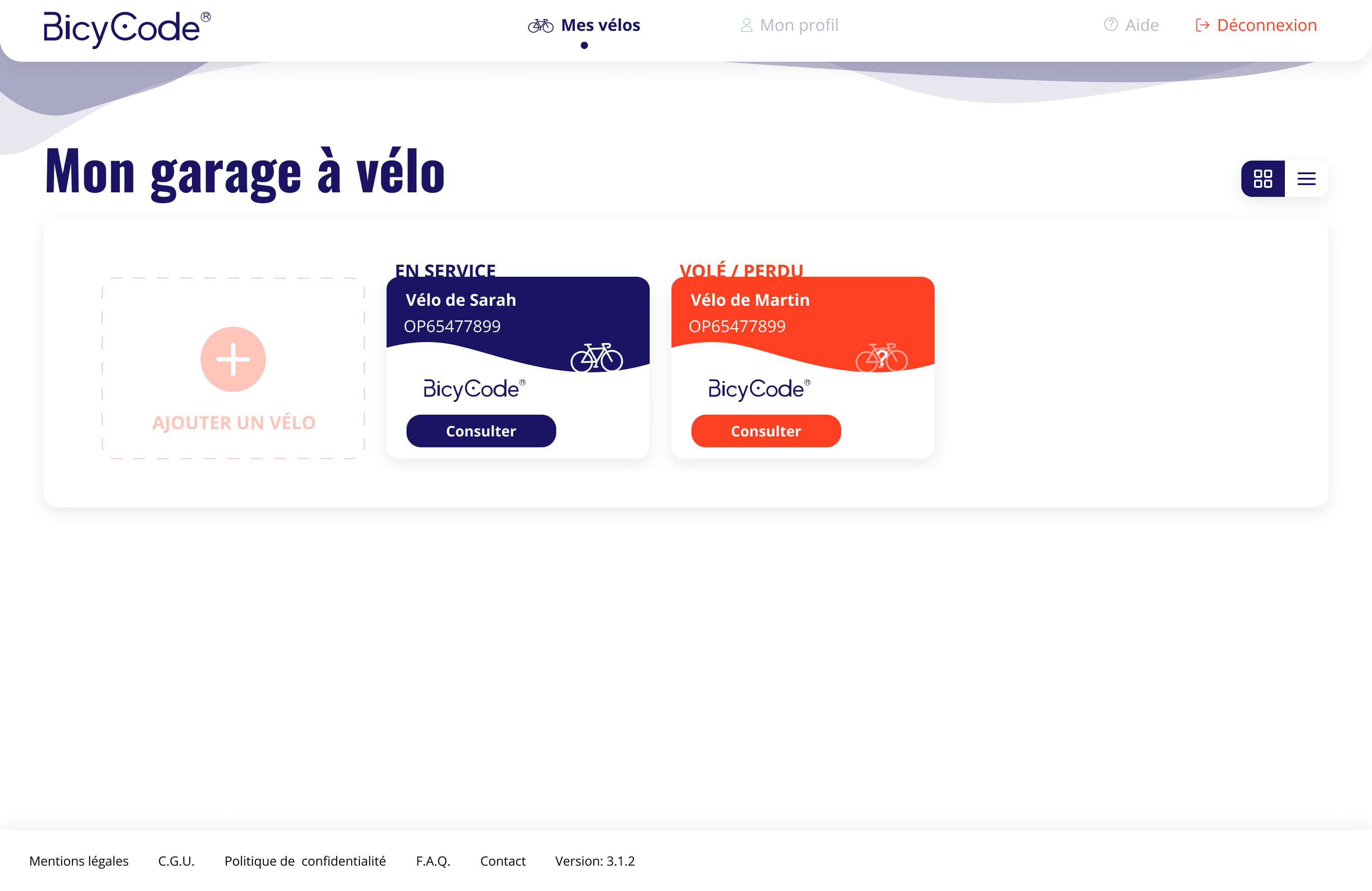
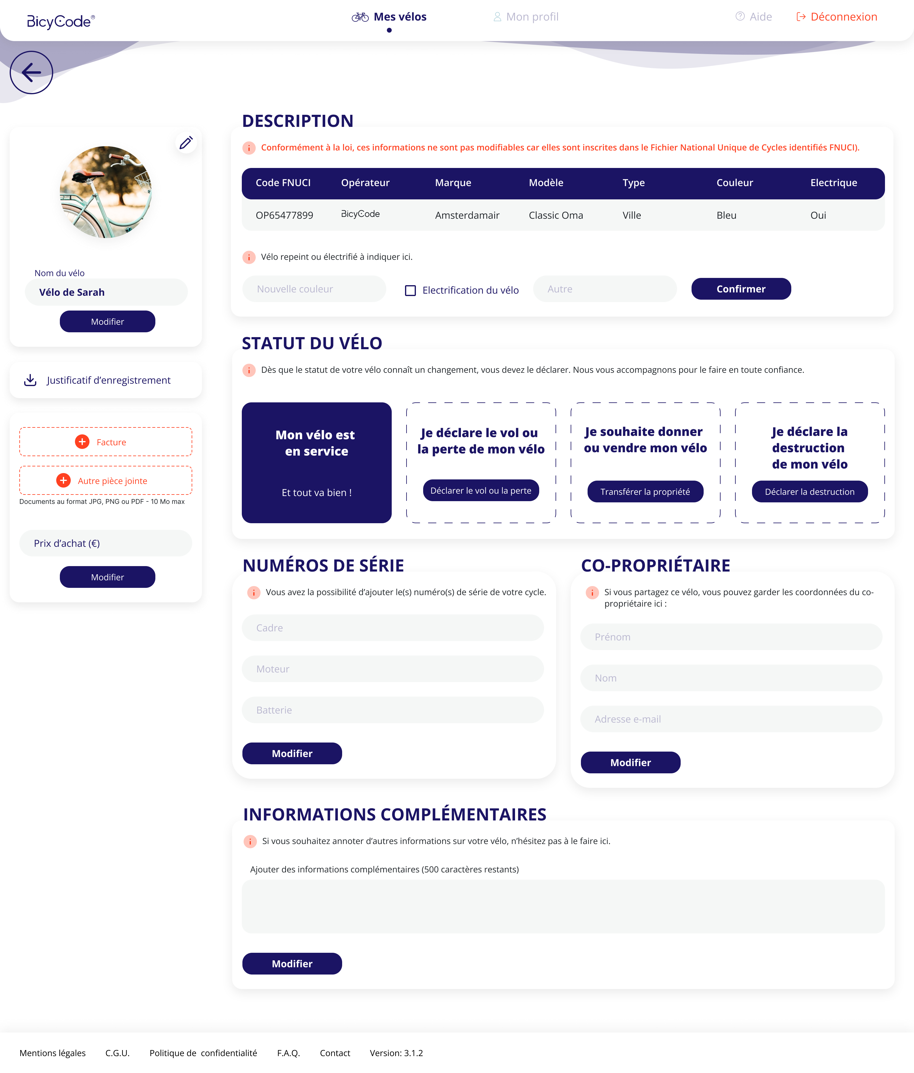
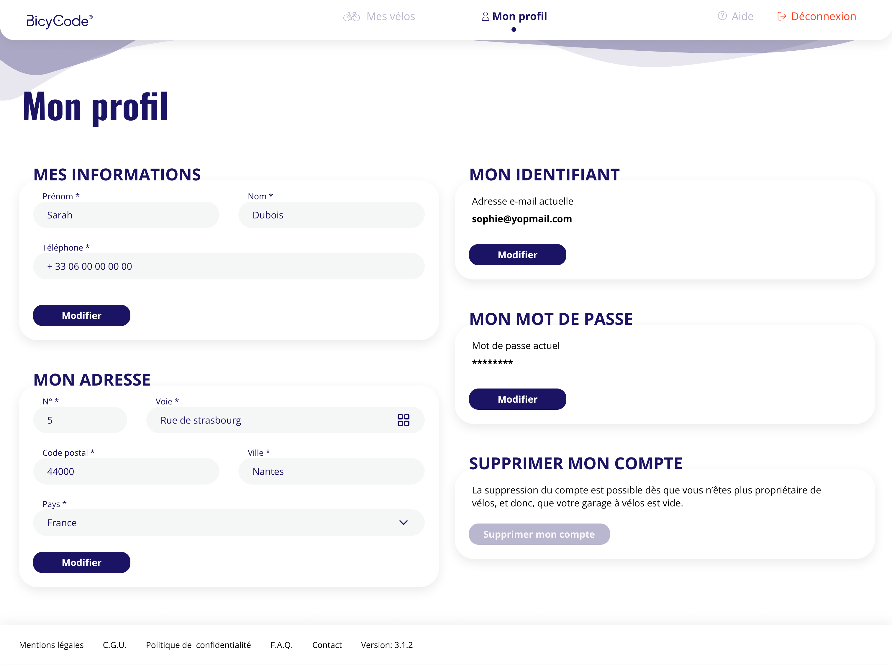
Users are now invited to create an account, where they can manage all their bikes in one place. They have access to comprehensive “bike profiles,” which can be used as a logbook.
The registration code is a distinguishing feature, but it is possible to personalize the name of a bike to make it easier to find (for example: Sarah's Bike, Martin's Bike, or Racing Bike, City Bike,etc.). It is now possible to add photos, maintenance invoices, and other notes relevant to the owner. This means that reporting a theft or sale is no longer a chore, but an opportunity to keep better track of your bikes.
The graphic redesign has also made the platform more user-friendly, giving users a more “serious” impression and making it more intuitive to use, which means it is faster and less stressful.
No communication about this reform has been made to the general public, so their behavior when buying a bike in stores will not change. In the absence of this communication, the reform is irrelevant.What is interesting is that the first version was rolled out very quickly in order to respond to the government's demands, not those of users. The assumptions were therefore wrong. Nevertheless, it was these assumptions that made it possible to analyze what users want and don't want in the field, and to quickly redesign the new platform accordingly.
Thus, with good internal communication and the ability to deliver quickly, it is possible to bounce back quickly on products that don't have time to be beta-tested, for x reasons.
To learn more about my involvement in this project, I would be happy to discuss it over coffee or tea! 🫖